
Meaning Behind Our Logo
- Learn Korean With Us

- Apr 1, 2023
- 1 min read
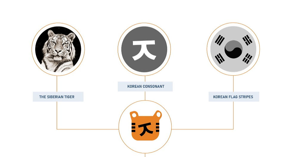
The logo is an ode to The Siberian Tiger - National Animal of Korea.
An important figure in the Korean culture and folklore, the design of the great cat is built by incorporating elements from Korean alphabets and the stripes of the flag. The Korean consonant X doubles up as the snout as well as the letter K while the stripes on the tiger are referenced from the stripes on the Korean flag. which represent the four natural elements- water, fire, earth and air. The logo follows a complimentary color palette of blue and orange, taking its inspiration from the elements of nature. The arm earthy tones of the majestic wild cat are a timeless symbol of strength and surefootedness and this is balanced with the cool azure palette, a reminder of open skies and expansive possibilities.
Our logo is designed by Anu Priya at Pine Cubes.


Comments